Project Specs
To build from scratch a complete brochure design that demonstrates the foundational elements of design and composition (point, line, plane, shape, form; rhythm, balance, space; scale; texture; format, framing; colour; hierarchy; unity, contrast, repetition, alignment, similarity, proximity; layers, transparency; typography).
Create a 4-page information brochure on a graphic designer. Include: abstract only title page, text-focused page, image-focus page, combination text and image page.
Document size: 10”x10”; margins a minimum of 0.25”; maximum two typefaces; consider how the style of the designer might influence the style of design for this brochure.
My Design Choices
While researching different designers for this project I came across Irma Boom and immediately fell in love with her designs and philosophy (which includes hiding the information that is boring, and making every book worthwhile—if it’s not absolutely necessary to read and feel the physical book, don’t bother making it, leave it as a pdf). I really wanted to incorporate her style into this brochure.
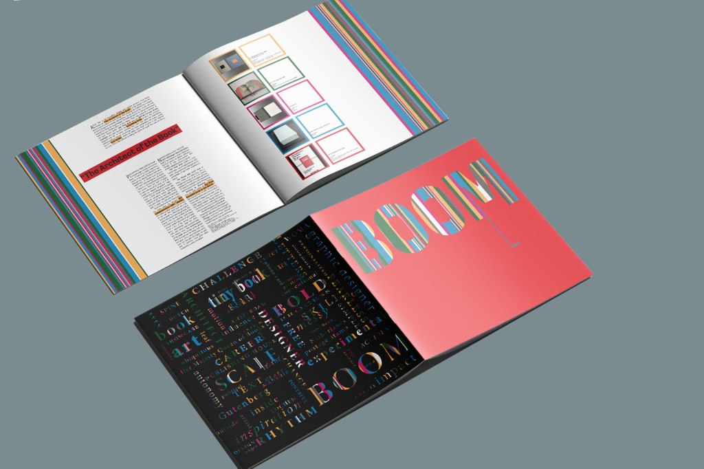
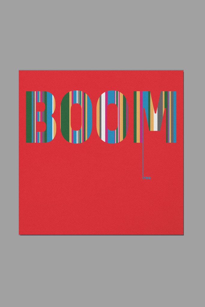
Title Page: heavily influenced by Irma Boom’s Boom Book: The Architecture of the Book. I wanted very little on the title page, and to make use of her name (Boom), so that just reading that felt like BOOM! The colours that can be seen through the cut-outs of her name were influenced by colour combinations that she uses together.
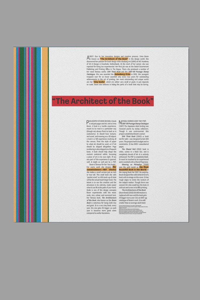
The interior pages, the text focused and the image focused, both have an extremely minimalistic design. The colour blocks on either edge are meant to be interesting to look at, because they are meant to be examined. The minimalism helps to emphasize the importance of the text that is present. On the interior right, are some examples of Boom’s most famous works, all taking up equal small thumbnails on the page so that each one can stand independent and separate. There are sources on both pages, but as Boom suggests, those are small because no one actually wants to read that information even though it has to be there.
The back cover is a word board to encompass many of the traits and features of Irma Boom. The coloured background ties the whole brochure together, and the black foreground acts as a foil for the front cover. In the Lower right hand corner it says “create impact”, and for me, that’s what this whole project was about. Creating Impact. With every page and every combination of colour. To this day, this is still the single project that I am most proud of.