Project Specs
To demonstrate understanding of the typographic design skills and principles by designing a multi-page book from scratch. Design and produce a book with front and back covers, of 12-16 pages. Include a half-title, full title, colophon, and any other pages you think relevant. Your book should provide an overview of the work of an influential and notable type designer. The dimensions and all paper/print specifications are up to you, as is the binding style.
Generate your own copy of general information and the designer’s overall impact and influence, and a 2-4 page “type specimen” that showcases one of the designer’s key typefaces.
My Design Choices
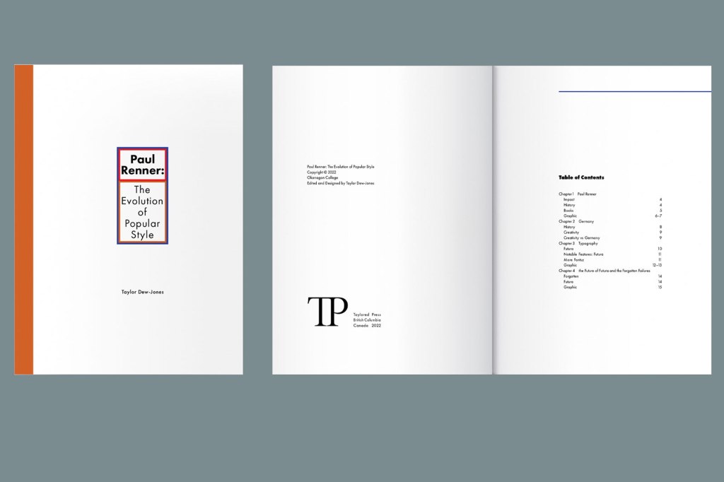
One of the key decisions I made for this booklet were the dimensions and margins. What might be considered a more regular sized book didn’t feel right since I wanted more of a “coffee table” booklet. So it had to be larger than a letter sized page folded in two but a letter size page not folded was the wrong width the height ratio. In the end, I went with an 8” x 10” booklet, which I could print easily on an 11” x 17” sheet of paper.
For the margins, I wanted to embody the principles and design choices that Paul Renner himself preferred. I studied Die Kunst der Typographie, or The Art of Typography, and followed a 2:2:3:4 margin ratio that Renner mentions as one of the more pleasing options.
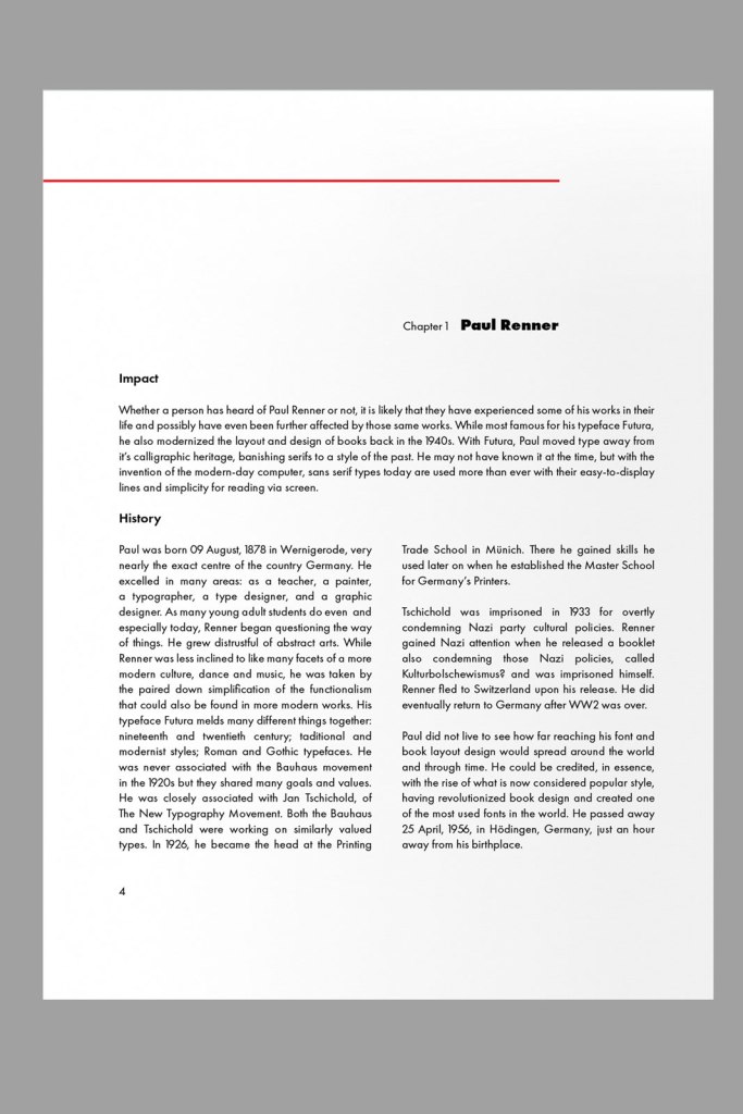
For the design of the booklet itself, it needed to be simple and legible, effective but not boring. A clean coloured line at the beginning of each chapter to bring some vividness to the pages while harkening back to Renner’s books and their spacious use of each page. A columned layout, because the book is quite wide so that keeps it more legible. A pop of colour in the text here and there, because this is my own modern design and not a replica of Renner’s.
As to the content, that was open to me as well. Although Renner is more famous for designing the typeface Futura, my own interests lean more towards book design. As a student who studied a bit of German culture and language, I found that some history of Germany really enriched the understanding of where Renner came from with his ideas about book design and type, as well as how some of his lesser known typefaces came into being like Steile Futura.