Project Specs
To use the strategies and skills you have gained for working with type to create a compelling cover design for a book.
Design a full cover spread (front, back, spine) for a professionally published book of your choice. The design should use text as its central focus and should essentially evoke the book’s subject matter and the flavor/tone of the writing.
My Design Choices
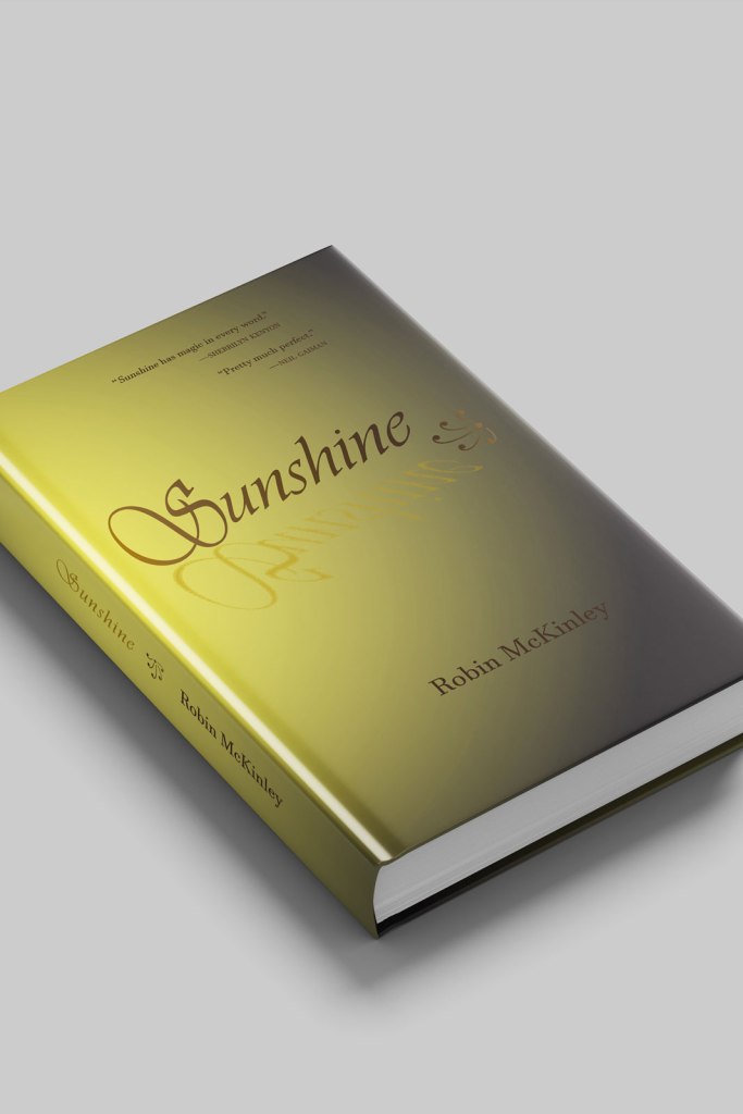
Well, first off, when I was first starting this project I knew right away I wanted to work with my favourite book of all time (which is saying something because I read a lot). Sunshine already has about five different covers, two of which I absolutely love, so it was a challenge coming up with something a bit different. Encompassing the tone of the story was really important to me because it is such an interesting and precious feeling that it gives you. An almost whimsical dark fairy tale with a heart of muted gold and hope.
I knew I wanted to work with a bright yellow, a dark fade, and absolutely no glitter or twinkle effect. After quite a bit of searching, I came across the font that’s used for the title. It’s reminiscent but not the same as on the original cover and in particular I fell in love with that capital “S”. I played around with some graphics, especially of two dimensional trees and a lake-scape but in the end I went with just a simple repeated glyph instead that fit the mood better. The whole reason I bought this book in the first place (almost twenty years ago now) was because the synopsis was so intriguing, because it tells you what this story is going to be about—sort of. It left me thinking “vampires, of course… but what else?!” I found any graphics I added distracted me from where I wanted the focus, so it’s just the synopsis, two glyphs, and some interest-piquing reviews on the back cover.
On the front cover, there is a shadow effect on the title but it seems backwards: it’s golden, irregular, and atomized. It looks cool but it’s also relevant to the story.
The main yellow of the background was the hardest choice because getting a black fade can make the yellow kind of muddy which I learned about while working on this. I was convinced it was the wrong yellow and the wrong fade effect up until I printed it, folded it, and shoved it on a book just to see. And it looked and felt… just right.